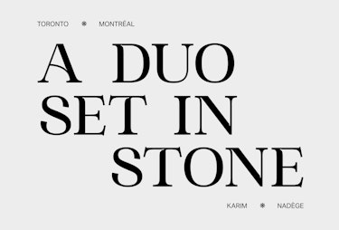
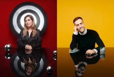
Sculpture is made up of two friends who combine images and words to mould ideas into solid content
Based in Montreal and Toronto, Sculpture collaborates on projects and campaigns with agencies and global brands, supporting their business growth on the French-Canadian market. The team works with companies in various areas of activity to achieve their marketing and creative objectives.
01 - Conception-rédaction
02 - Services
03 - Typeface creation
04 - Brand objects
05 - Brand content



SERVICES
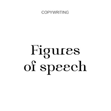
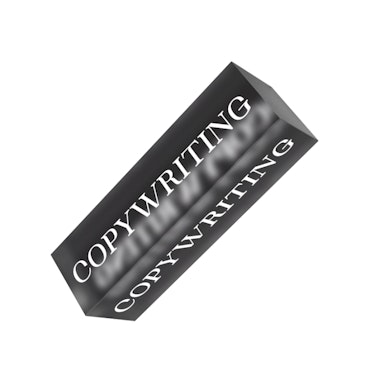
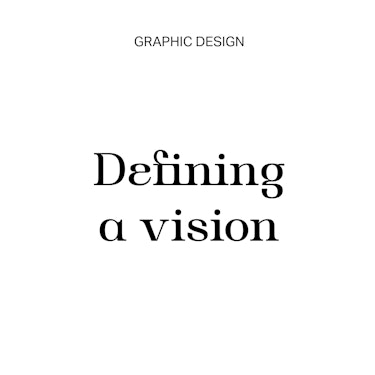
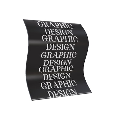
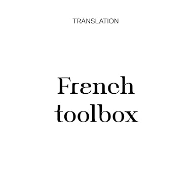
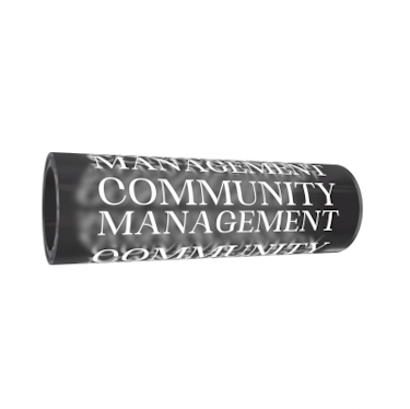
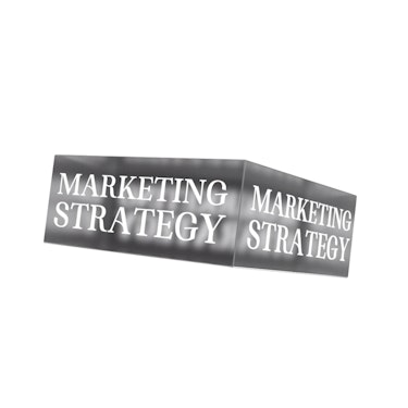
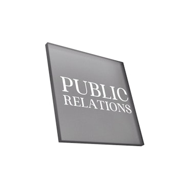
Touching on different stages of the creative process, the business offer has been split into six services: copywriting, translation, graphic design, marketing strategy, community management, and public relations.
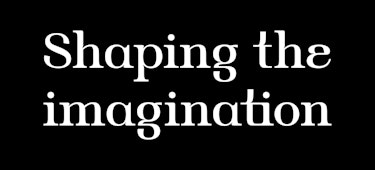
This approach makes it easier to assign specific services to each individual project. 3D objects were also created to present each of them. In order to illustrate the services in a more figurative way, they were associated with a respective tagline related to the lexical field of sculpture.

TYPEFACE
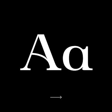
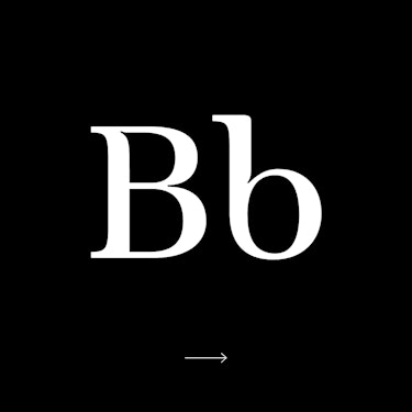
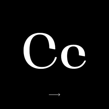
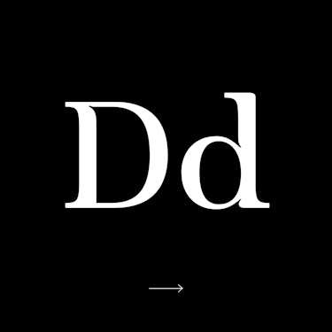
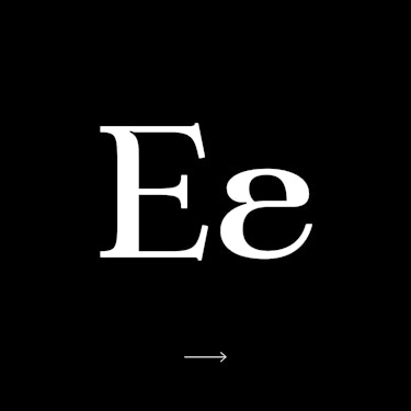
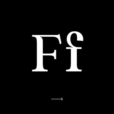
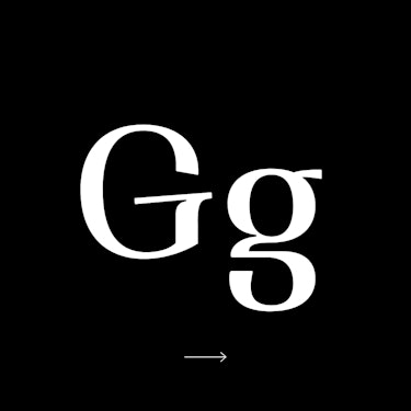
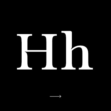
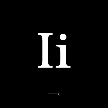
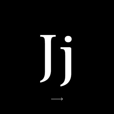
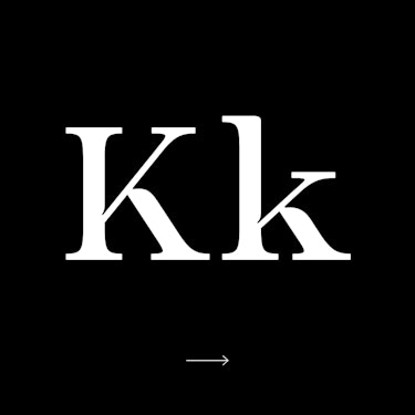
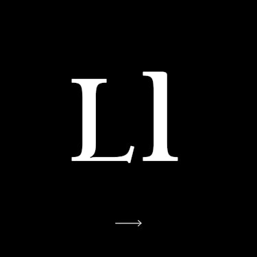
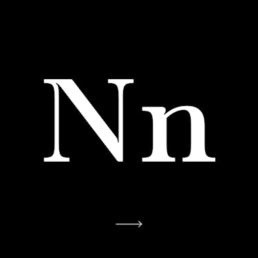
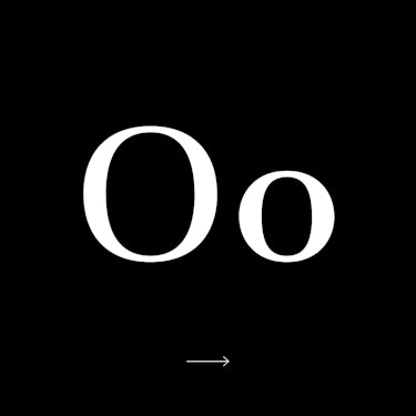
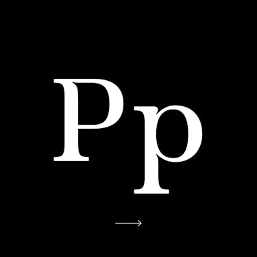
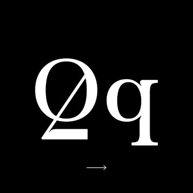
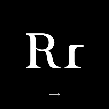
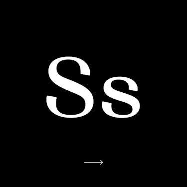
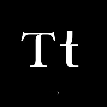
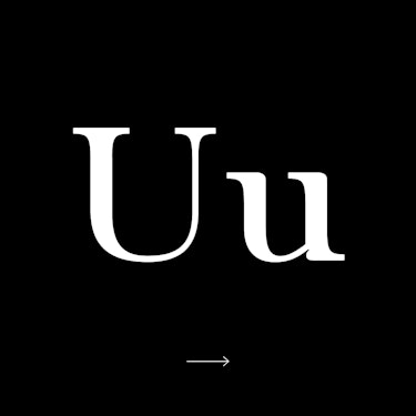
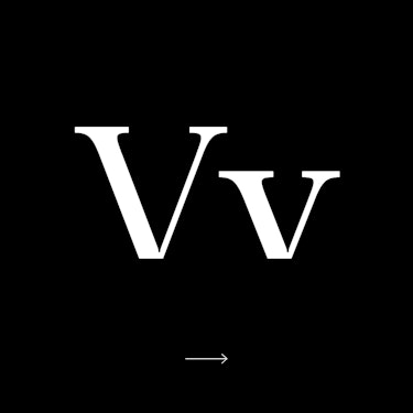
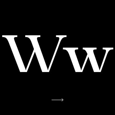
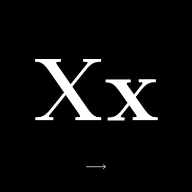
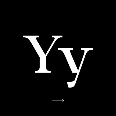
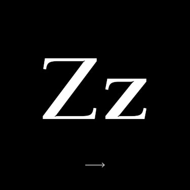
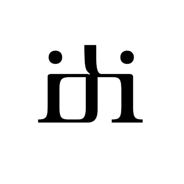
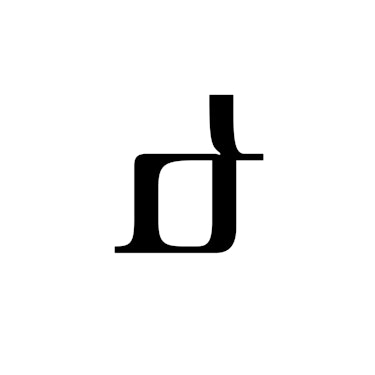
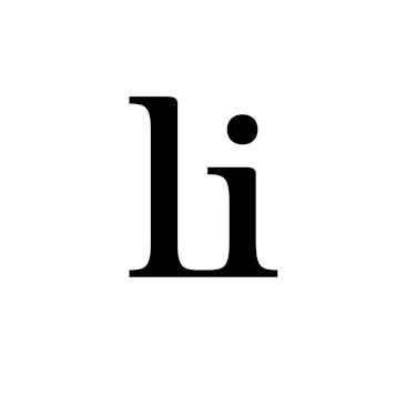
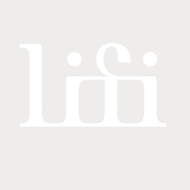
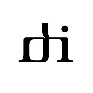
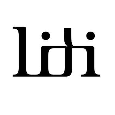
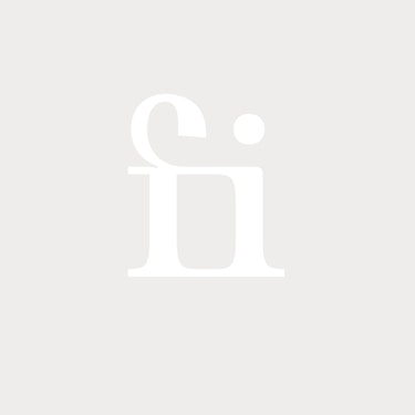
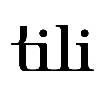
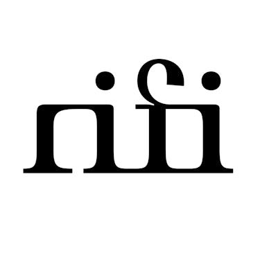
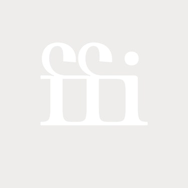
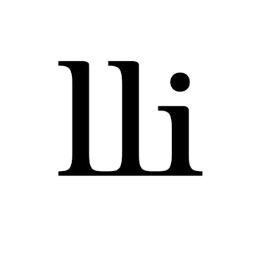
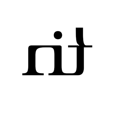
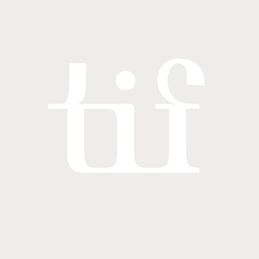
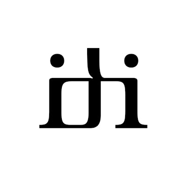
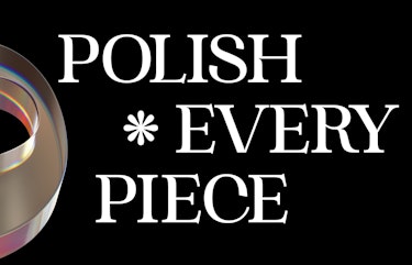
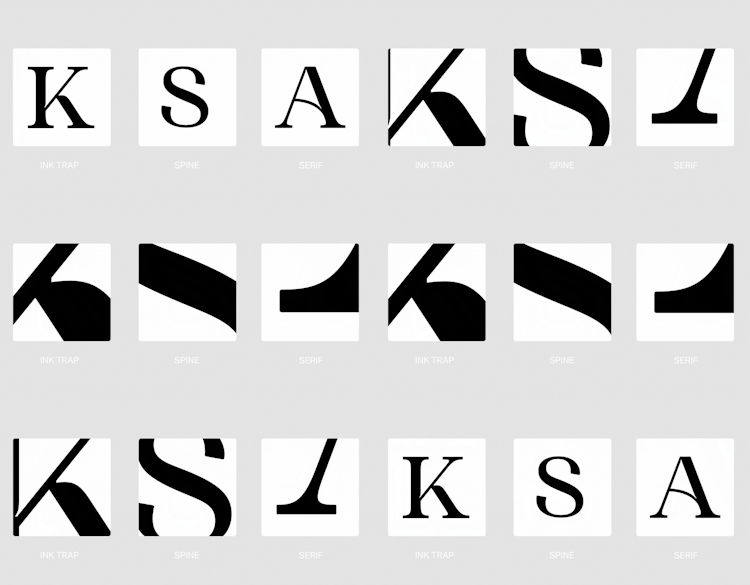
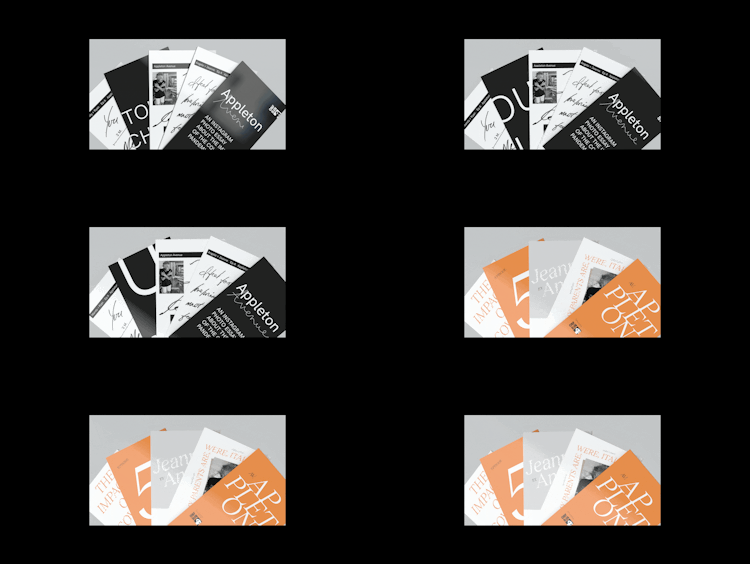
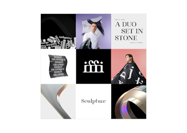
Used as a main work tool, the custom typeface created for Sculpture features classic forms with a more modern touch on certain characters. Elegant serifs and precise ink traps raise both the editorial aspect of the business and the visual attention to detail.
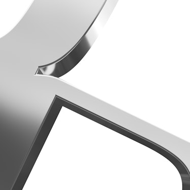
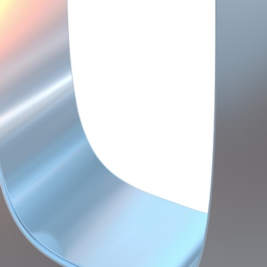
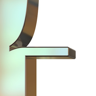
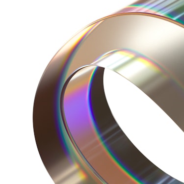
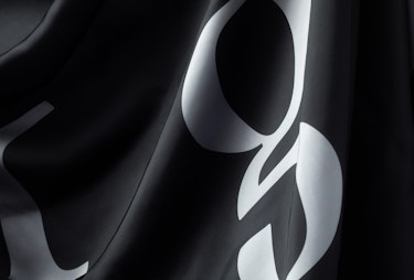
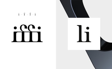
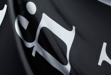
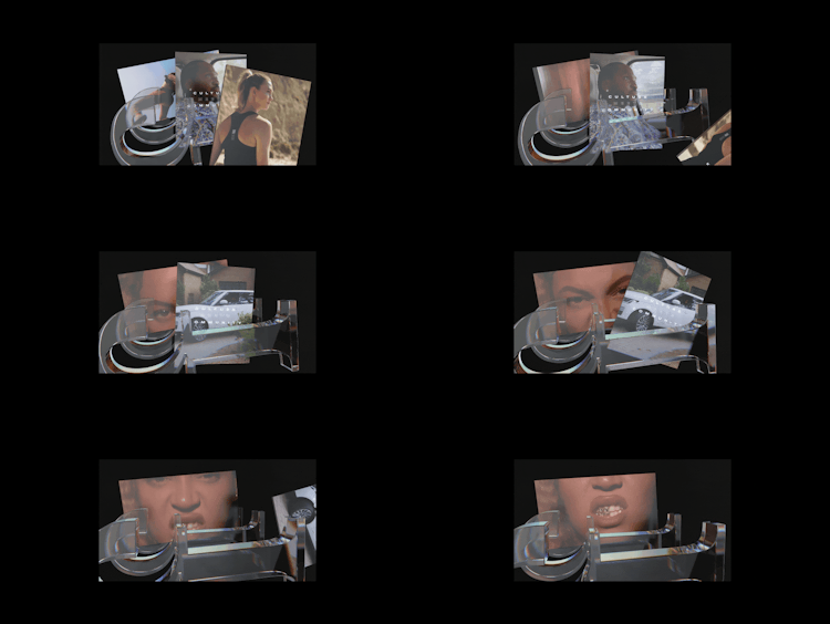
Inspired by the first printing techniques, unique ligatures have also been designed, suggesting sculptural entities. They provide the perfect blend between letters and graphic representation. Each ligature has also been modelled in 3D in different textures related to materials used in carving. The brand identity’s tones being generally simple, interplay of lights and reflections on the 3D ligatures add dynamism to the graphic look and feel. The ligatures were then oversized to give a completely different design to these letter combinations to make it a graphic signature in its own right.


BRAND OBJECTS
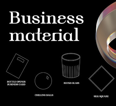
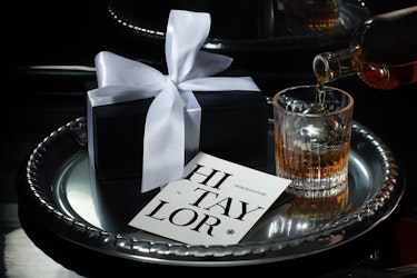
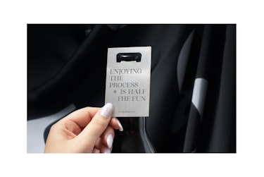
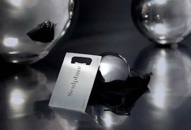
The brand identity can be shaped under different objects that underline the joy of working.
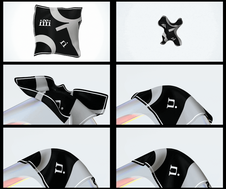
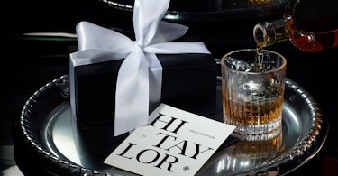
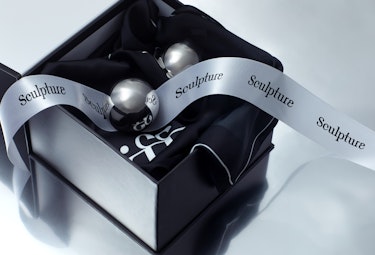
For the launch of the company, we have put together a festive promotional set with a sculptural look, incorporating diverse materials, including a bottle opener as a business card, two stainless steel cold stones that recall the dot over the letter “i”, as well as a crystal glass and silk square that highlight the typography created for Sculpture.


BRAND CONTENT
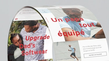
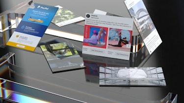
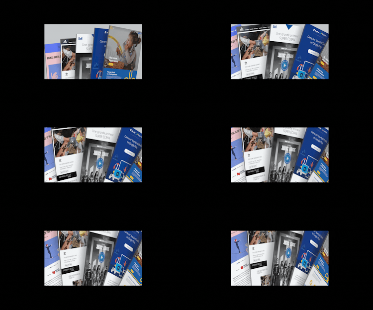
The brand image was declined for online content and social media such as Facebook, Instagram, Behance, and Linkedin.
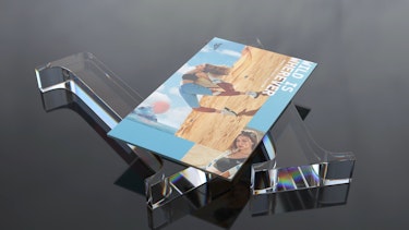
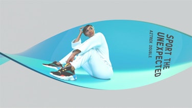
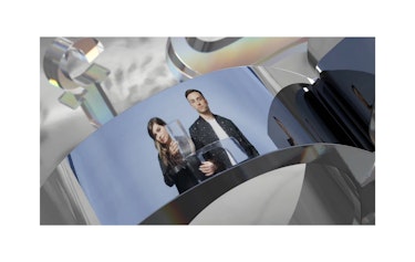
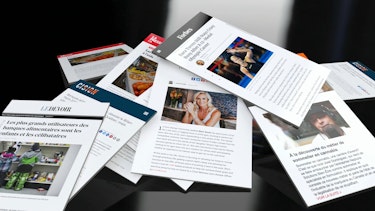
The creation of a bilingual brand video made it possible to present the company and various key projects in a coherent way, highlighting each service while respecting the variety of formats and types of content, thanks to a system of boards and 3D typeface modelling.
Credits :
Nadège Dionne-Tremblay
Karim Marier-El Khayat
With the collaboration of
Pangram Pangram Foundry | Typeface
LM Chabot | Photography (Portraits and team)
Vickie Rousseau | Photography (Brand objects)
Mat & Fab | Motion Design
CUSP | Website
William Rioux | Soundtrack
Simon Janelle | 3D Modelling
